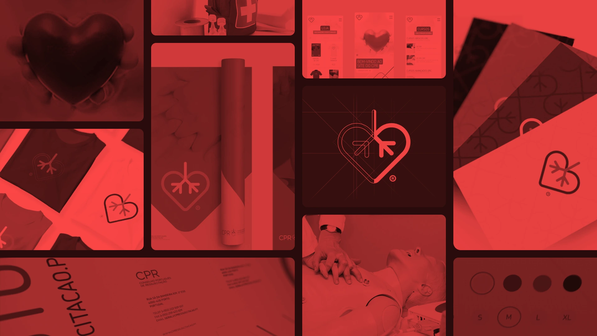
Portuguese Resuscitation Council
A life-saving mission evolved into trusted public identity

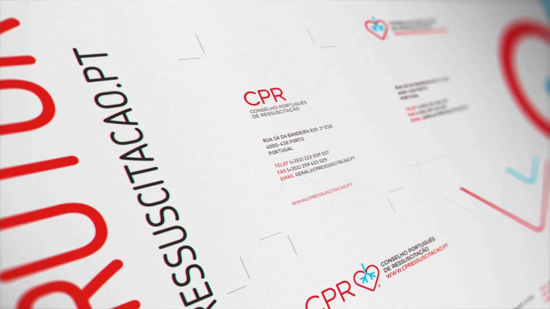
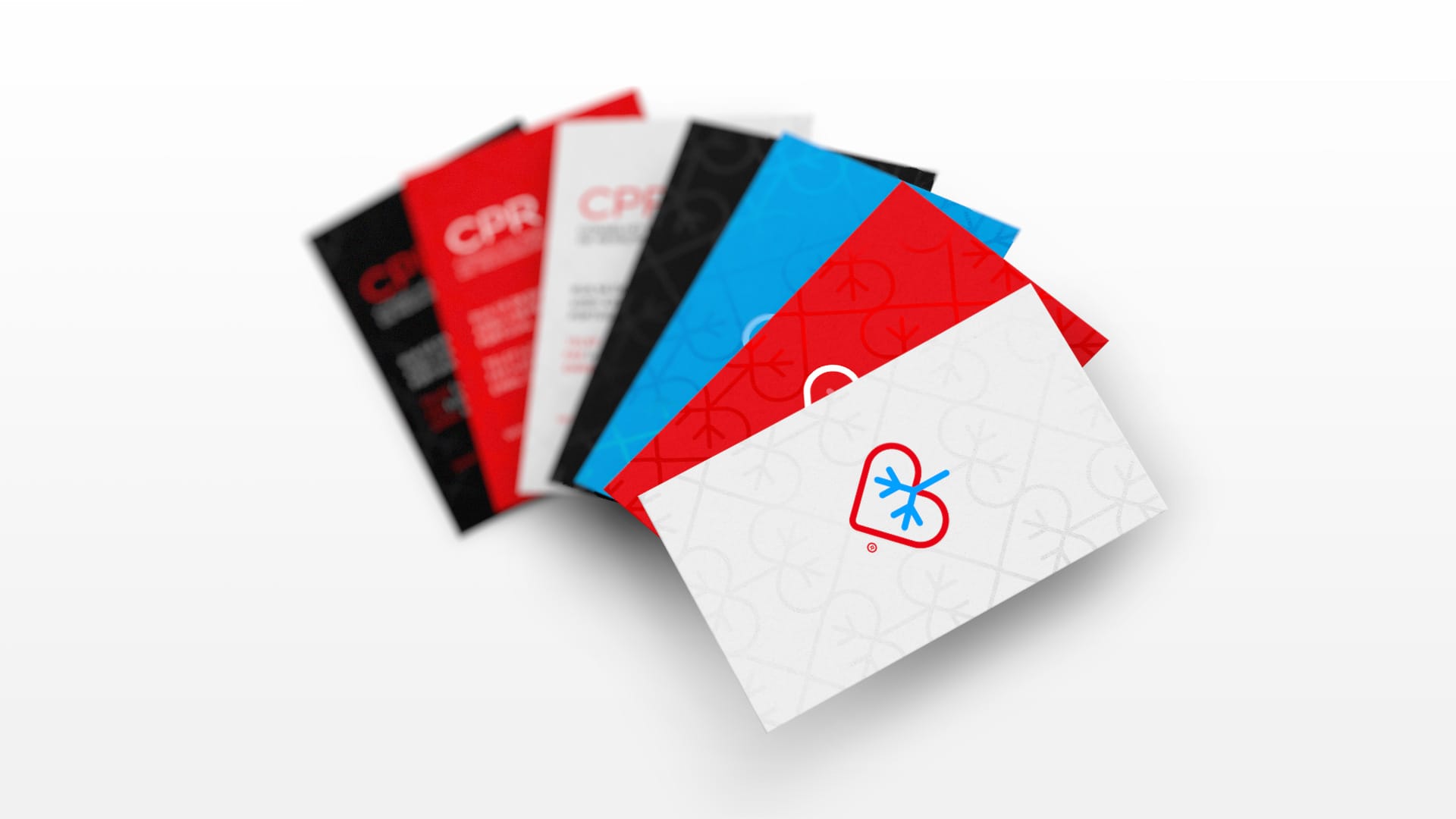
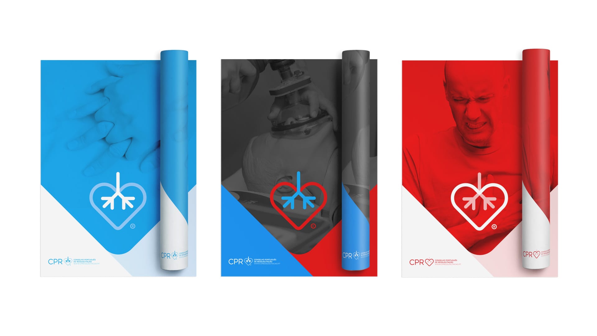
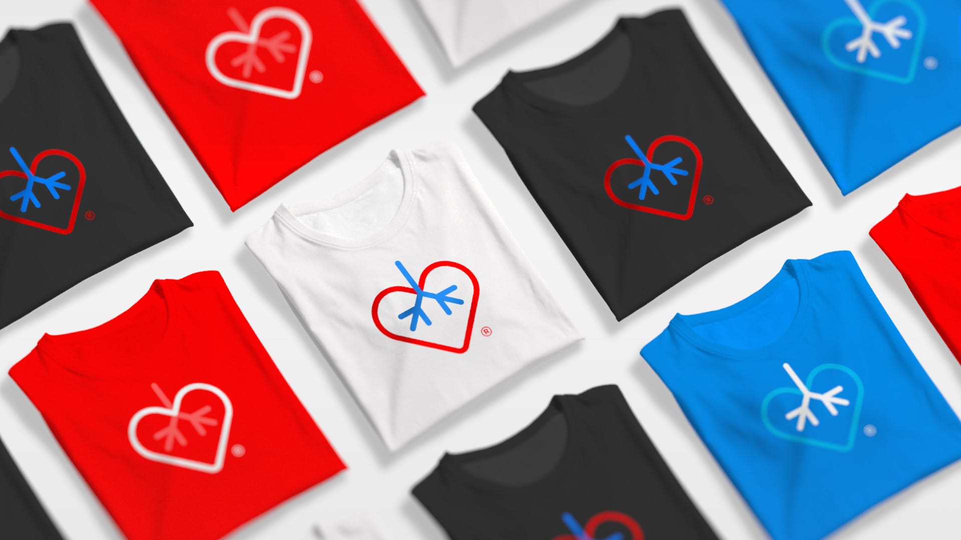
Branding
Web UX
Branding
Web UX
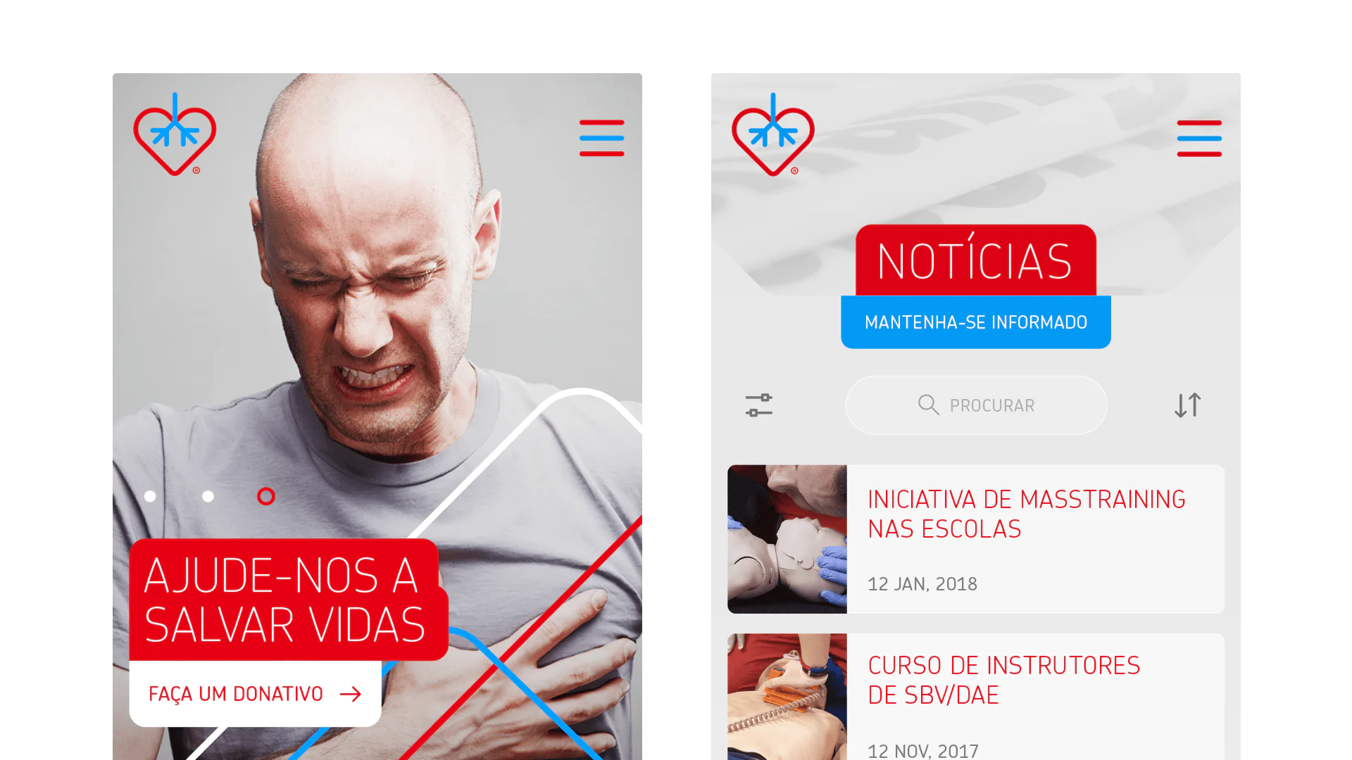
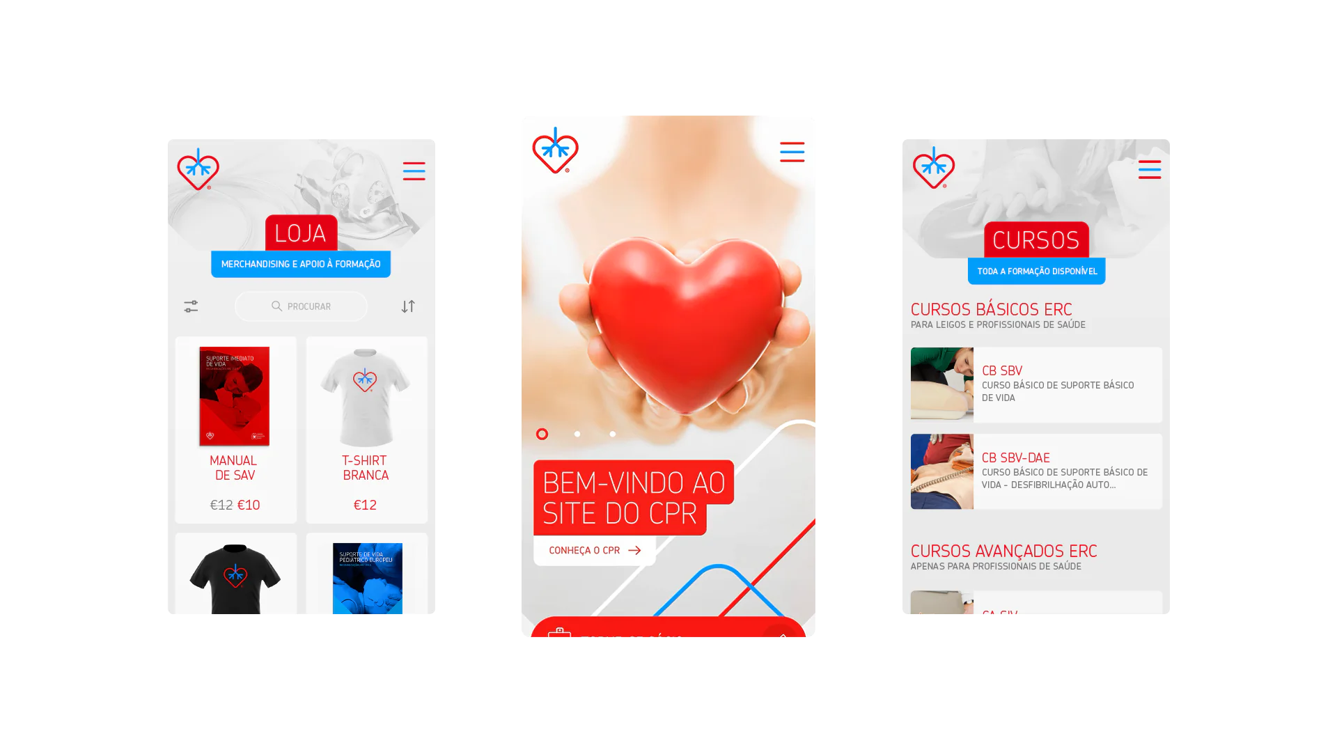
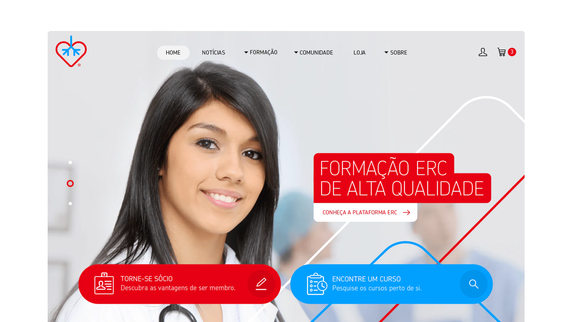
Resuscitation training only works when people trust the institution behind it, and CPR was losing that ground. CPR - Conselho Português de Ressuscitação plays a vital role in training people to act with confidence and care in life-saving support. Without visual consistency, their authority as a national reference was quietly fragmenting.
1
Position CPR as a national reference in resuscitation
2
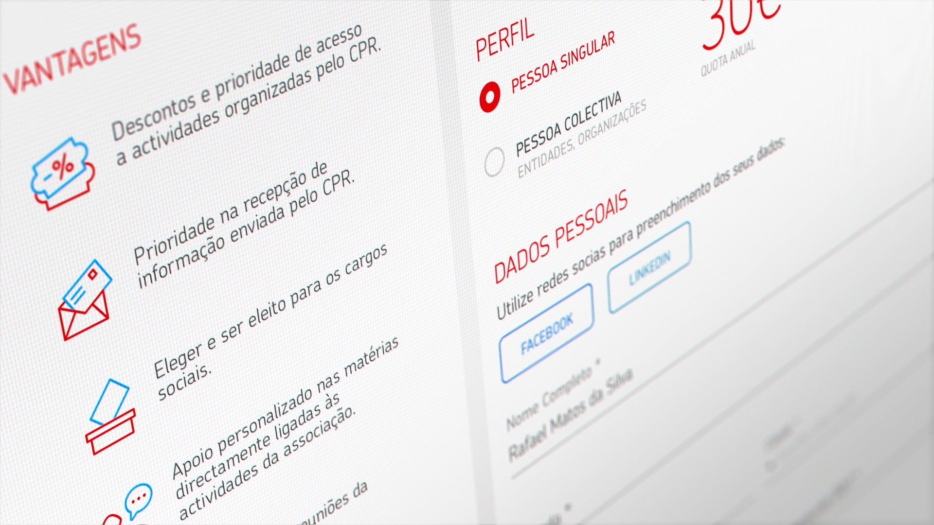
Strengthen ties with healthcare professionals and communities
3
Deliver accessible education that raises awareness and saves lives
Website Engineering
Widgilabs
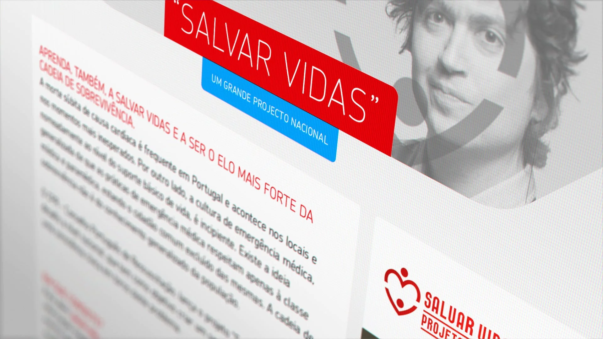

From learning to lifesaving
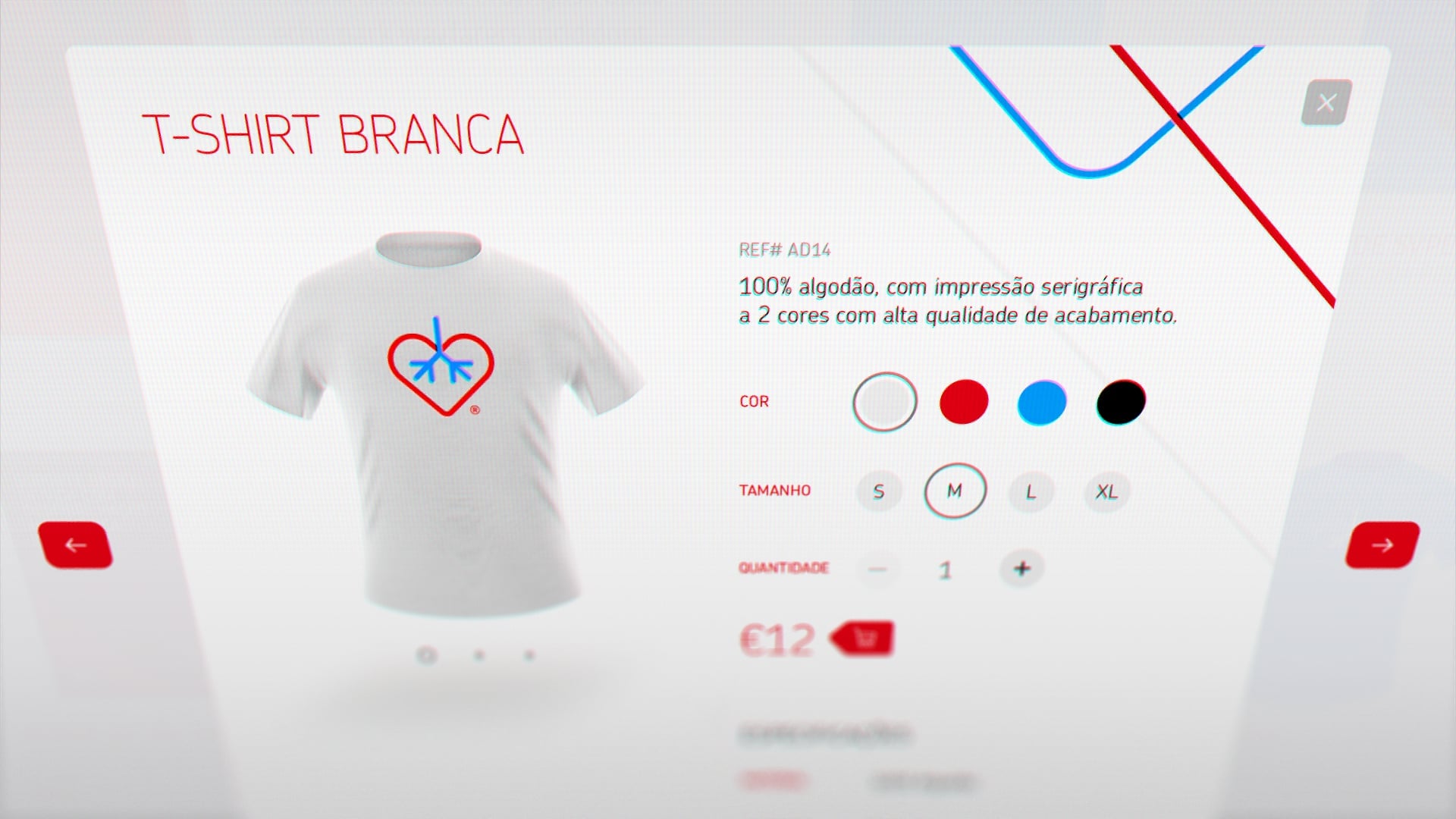
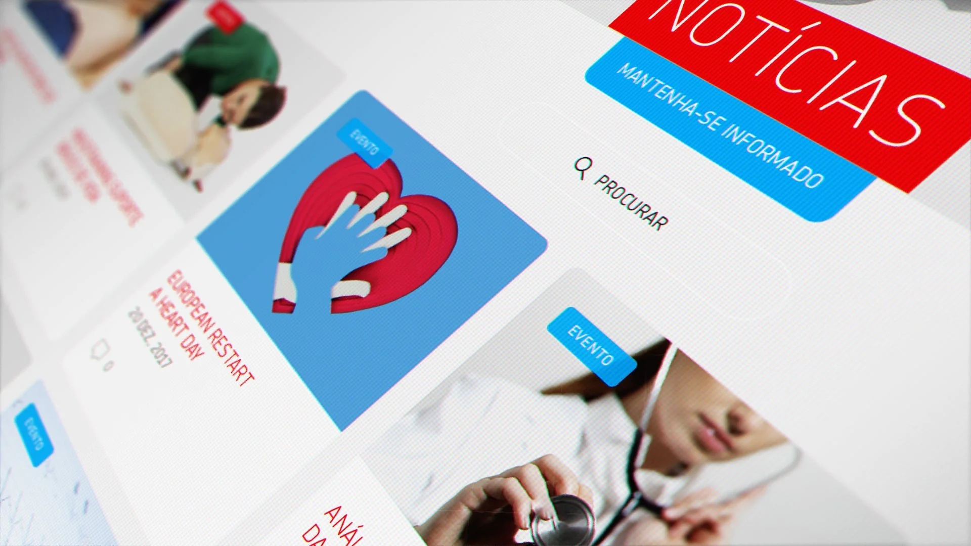
Across classrooms and communities, the identity transformed learning into participation.
Through thoughtful synthesis, our brand now gives form to our mission, responsibility, and real-world impact of our work.

Micaela Monteiro
Advisor at Conselho Português de Ressuscitação
Beyond design, this work supports people who step forward when clarity and action are needed most. By strengthening how knowledge is shared and applied, it enables communities to respond together with confidence, care, and purpose.
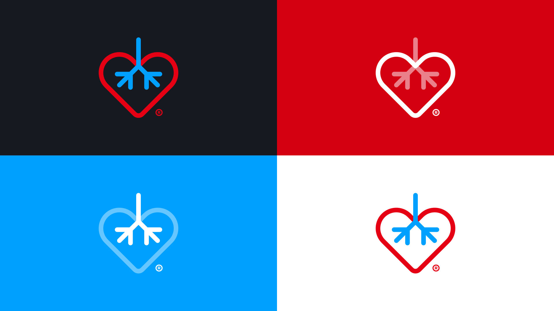
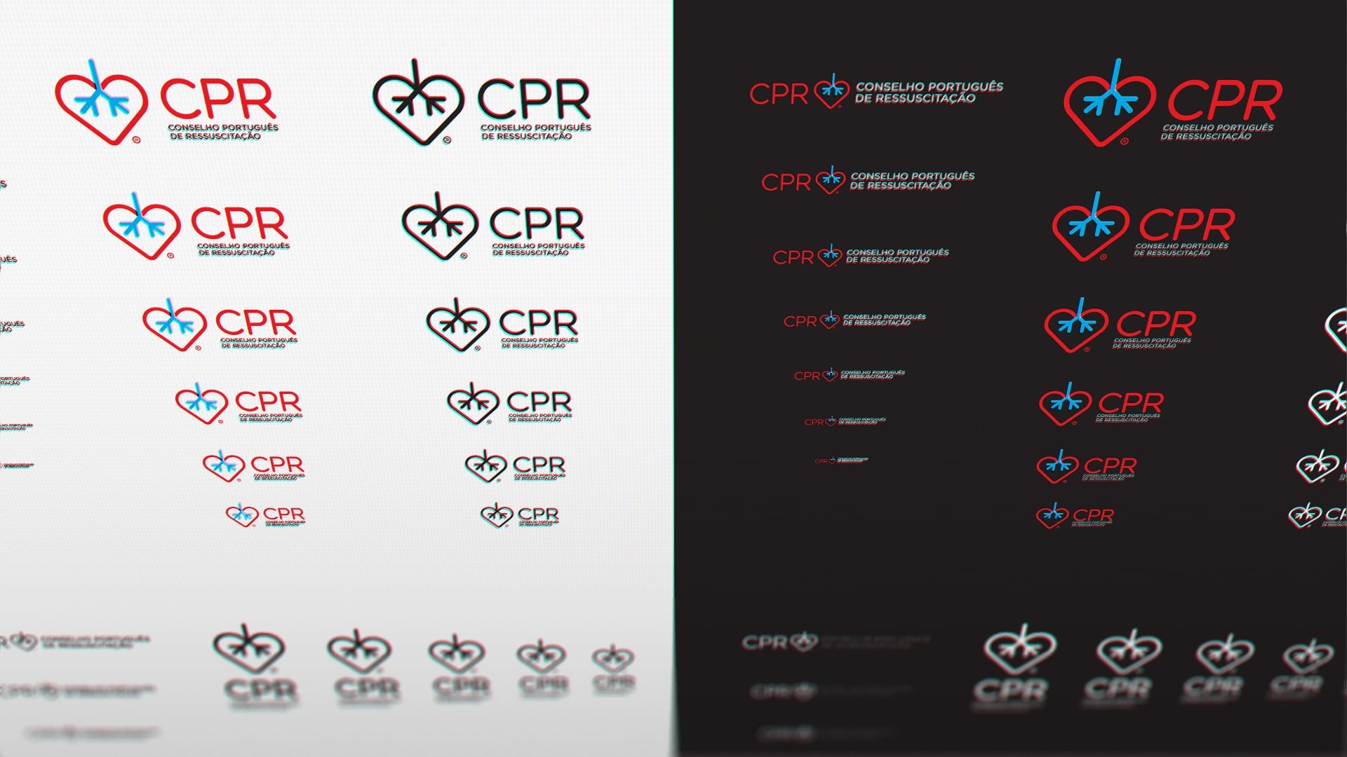
Identity System
Art Direction
Discover the vision
Branding
Web UX
Healthcare
Resuscitation training only works when people trust the institution behind it, and CPR was losing that ground. CPR - Conselho Português de Ressuscitação plays a vital role in training people to act with confidence and care in life-saving support. Without visual consistency, their authority as a national reference was quietly fragmenting.
1
Position CPR as a national reference in resuscitation
2
Strengthen ties with healthcare professionals and communities
3
Deliver accessible education that raises awareness and saves lives
Website Engineering
Widgilabs
From learning to lifesaving
Across classrooms and communities, the identity transformed learning into participation.
Through thoughtful synthesis, our brand now gives form to our mission, responsibility, and real-world impact of our work.
Micaela Monteiro
Advisor at Conselho Português de Ressuscitação
Beyond design, this work supports people who step forward when clarity and action are needed most. By strengthening how knowledge is shared and applied, it enables communities to respond together with confidence, care, and purpose.
Identity System
Art Direction
Technology
Discover the vision


